
Datasets
Alternative Data
Introduction
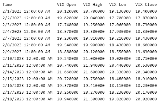
This page explains how to request, manipulate, and visualize historical alternative data. This tutorial uses the VIX Daily Price dataset from the CBOE as the example dataset.
Create Subscriptions
Follow these steps to subscribe to an alternative dataset from the Dataset Market:
- Create a
QuantBook. - Call the
add_datamethod with the dataset class, a ticker, and a resolution and then save a reference to the alternative dataSymbol.
qb = QuantBook()
vix = qb.add_data(CBOE, "VIX", Resolution.DAILY).symbol
v3m = qb.add_data(CBOE, "VIX3M", Resolution.DAILY).symbol
To view the arguments that the add_data method accepts for each dataset, see the dataset listing.
If you don't pass a resolution argument, the default resolution of the dataset is used by default. To view the supported resolutions and the default resolution of each dataset, see the dataset listing.
Get Historical Data
You need a subscription before you can request historical data for a dataset. On the time dimension, you can request an amount of historical data based on a trailing number of bars, a trailing period of time, or a defined period of time. On the dataset dimension, you can request historical data for a single dataset subscription, a subset of the dataset subscriptions you created in your notebook, or all of the dataset subscriptions in your notebook.
Trailing Number of Bars
To get historical data for a number of trailing bars, call the history method with the Symbol object(s) and an integer.
# DataFrame
single_history_df = qb.History(vix, 10)
subset_history_df = qb.History([vix, v3m], 10)
all_history_df = qb.History(qb.Securities.Keys, 10)

# Slice objects
all_history_slice = qb.History(10)

# CBOE objects
single_history_data_objects = qb.History[CBOE](vix, 10)
subset_history_data_objects = qb.History[CBOE]([vix, v3m], 10)
all_history_data_objects = qb.History[CBOE](qb.Securities.Keys, 10)
The preceding calls return the most recent bars, excluding periods of time when the exchange was closed.
Trailing Period of Time
To get historical data for a trailing period of time, call the history method with the Symbol object(s) and a timedelta.
# DataFrame
single_history_df = qb.History(vix, timedelta(days=3))
subset_history_df = qb.History([vix, v3m], timedelta(days=3))
all_history_df = qb.History(qb.Securities.Keys, timedelta(days=3))

# Slice objects
all_history_slice = qb.History(timedelta(days=3))

# CBOE objects
single_history_data_objects = qb.History[CBOE](vix, timedelta(days=3))
subset_history_data_objects = qb.History[CBOE]([vix, v3m], timedelta(days=3))
all_history_data_objects = qb.History[CBOE](qb.Securities.Keys, timedelta(days=3))
The preceding calls return the most recent bars or ticks, excluding periods of time when the exchange was closed.
Defined Period of Time
To get historical data for a specific period of time, call the history method with the Symbol object(s), a start datetime, and an end datetime. The start and end times you provide are based in the notebook time zone.
start_time = datetime(2021, 1, 1)
end_time = datetime(2021, 3, 1)

# DataFrame
single_history_df = qb.History(vix, start_time, end_time)
subset_history_df = qb.History([vix, v3m], start_time, end_time)
all_history_df = qb.History(qb.Securities.Keys, start_time, end_time)

# Slice objects
all_history_slice = qb.History(start_time, end_time)

# CBOE objects
single_history_data_objects = qb.History[CBOE](vix, start_time, end_time)
subset_history_data_objects = qb.History[CBOE]([vix, v3m], start_time, end_time)
all_history_data_objects = qb.History[CBOE](qb.Securities.Keys, start_time, end_time)
The preceding calls return the bars or ticks that have a timestamp within the defined period of time.
If you do not pass a resolution to the history method, the history method uses the resolution that the add_data method used when you created the subscription.
Wrangle Data
You need some historical data to perform wrangling operations. The process to manipulate the historical data depends on its data type. To display pandas objects, run a cell in a notebook with the pandas object as the last line. To display other data formats, call the print method.
DataFrame Objects
If the history method returns a DataFrame, the first level of the DataFrame index is the encoded dataset Symbol and the second level is the end_time of the data sample. The columns of the DataFrame are the data properties.
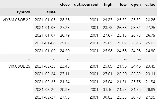
To select the historical data of a single dataset, index the loc property of the DataFrame with the dataset Symbol.
all_history_df.loc[vix] # or all_history_df.loc['VIX']
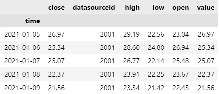
To select a column of the DataFrame, index it with the column name.
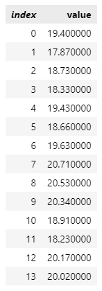
all_history_df.loc[vix]['close']
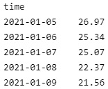
If you request historical data for multiple tickers, you can transform the DataFrame so that it's a time series of close values for all of the tickers. To transform the DataFrame, select the column you want to display for each ticker and then call the unstack method.
all_history_df['close'].unstack(level=0)
The DataFrame is transformed so that the column indices are the Symbol of each ticker and each row contains the close value.
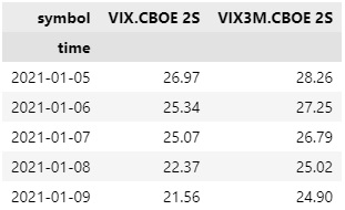
df["VIX close"]
Slice Objects
If the history method returns Slice objects, iterate through the Slice objects to get each one. The Slice objects may not have data for all of your dataset subscriptions. To avoid issues, check if the Slice contains data for your ticker before you index it with the dataset Symbol.
Plot Data
You need some historical alternative data to produce plots. You can use many of the supported plotting libraries to visualize data in various formats. For example, you can plot candlestick and line charts.
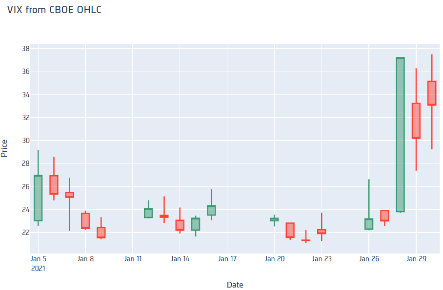
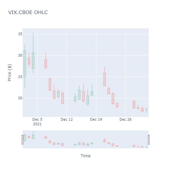
Candlestick Chart
You can only create candlestick charts for alternative datasets that have open, high, low, and close properties.
Follow these steps to plot candlestick charts:
- Get some historical data.
- Import the
plotlylibrary. - Create a
Candlestick. - Create a
Layout. - Create a
Figure. - Show the
Figure.
history = qb.history(vix, datetime(2021, 1, 1), datetime(2021, 2, 1)).loc[vix]
import plotly.graph_objects as go
candlestick = go.Candlestick(x=history.index,
                             open=history['open'],
                             high=history['high'],
                             low=history['low'],
                             close=history['close'])
layout = go.Layout(title=go.layout.Title(text='VIX from CBOE OHLC'),
                   xaxis_title='Date',
                   yaxis_title='Price',
                   xaxis_rangeslider_visible=False)
fig = go.Figure(data=[candlestick], layout=layout)
fig.show()
Candlestick charts display the open, high, low, and close prices of the alternative data.
Line Chart
Follow these steps to plot line charts using built-in methods:
- Get some historical data.
- Select the data to plot.
- Call the
plotmethod on thepandasobject. - Show the plot.
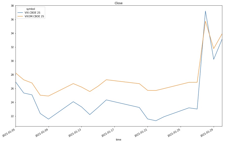
history = qb.history([vix, v3m], datetime(2021, 1, 1), datetime(2021, 2, 1))
values = history['close'].unstack(0)
values.plot(title = 'Close', figsize=(15, 10))
plt.show()
Line charts display the value of the property you selected in a time series.
Examples
The following examples demonstrate some common practices for applying the Equity Fundamental Data dataset.
Example 1: PE Ratio Line Chart
The following example studies the trend of 10-year yield curve using a line chart.
# Create a QuantBook
qb = QuantBook()

# Request 10-year US Yield Curve historical data.
symbol = qb.add_data(USTreasuryYieldCurveRate, "USTYCR").symbol
history = qb.history(
    USTreasuryYieldCurveRate,
    symbol,
    start=qb.time - timedelta(days=365),
    end=qb.time,
    resolution=Resolution.DAILY,
    flatten=True
)

# Select the 10-year US Yield Rate to study.
pe_ratio = history.droplevel([0]).tenyear
# Plot the 10-year US Yield Rate line chart.
pe_ratio.plot(title=f"10-year US Yield Rate by Time of {symbol}", ylabel="Yield Rate")
You can also see our Videos. You can also get in touch with us via Discord.
Did you find this page helpful?