Contents
Research
Alternative Data
Introduction
There is a vast amount of alternative data available that we can use for developing signals in our Alphas. This allows us to create many unique hypotheses about the relationships between our data sources and the market, such as creating NLP models from twitter data to determine market sentiment or using Federal Reserve data to rebalance a portfolio.
QuantConnect provides a large library of alternative data sources. This includes free data sources like SEC filings, Federal Reserve data, and also paid sources like new data from Tiingo. You can find a complete list of alternative data sources in Alternative Data documentation. Most of the alternative data sources are also available in the research environment. This allows us to directly analyze a wide variety of data.
Edgar SEC Filings
Publicly traded companies in the US must file important investor notices (8-K) quarterly reports (10-Q), yearly reports (10-K), and any other publicly available reports to the SEC. These filings contain important information about a company's finances, including their income statements and balance sheets.
The report contents are not parsed in any way. The contents range from plain text to XBRL structured data format. For more information about the SEC and structured data formats, please visit the SEC's Office of Structured Disclosure webpage.
Making History Calls
SEC filing data is a linked data source. This means filing data is tied to the underlying equity whenever possible. This linkage is performed by the ticker used at the time of the filing. To add the right data to your strategy, you should use the equity symbol when you request SEC data.
# We must import any custom data that we want to use
from QuantConnect.Data.Custom.SEC import *


# Request underlying equity data.
aapl = qb.AddEquity("AAPL")

# Add SEC 10-Q (quarterly report) filings for Apple
aapl_10Q = qb.AddData(SECReport10Q, aapl)

# Add SEC 10-K (yearly report) filings for Apple
aapl_10K = qb.AddData(SECReport10K, aapl)

# Add SEC 8-K (investor notices) filings for Apple
aapl_8K = qb.AddData(SECReport8K, aapl)
We can then make requests for AAPL's historical price data and report data using qb.History. History calls for alternative data sources are similar to history calls for price data. We can use either qb.History(Type, Symbol, StartDate, EndDate), where Type is the data type, Symbol is the symbol for which to retrieve data for, or we can use qb.History(Type, Symbol, Period), which returns historical data from the given past period starting from today's date.
# We request for 1000 days of data starting from today
aapl_history = self.History(aapl.Symbol, timedelta(days=1000), Resolution.Daily)

report_history = self.History(SECReport8K, aapl_8K.Symbol, timedelta(days=1000))
Accessing and Manipulating Data
We can then analyze this data by plotting it. Let's analyze the performance of AAPL in the days after an 8-K report is released. Let's first plot the daily close values of AAPL.
# Format our chart
plt.title(f'Stock price {n} days after 8-K report released (AAPL)')
plt.xlabel('Date')
plt.ylabel('Price')


# Access the close column
aapl_daily_close = aapl_history_daily['close']

# Foward fill missing data points and plot it as a transparant(alpha=0.2) line graph.
aapl_daily_close.fillna(method='ffill').plot(alpha=0.2)
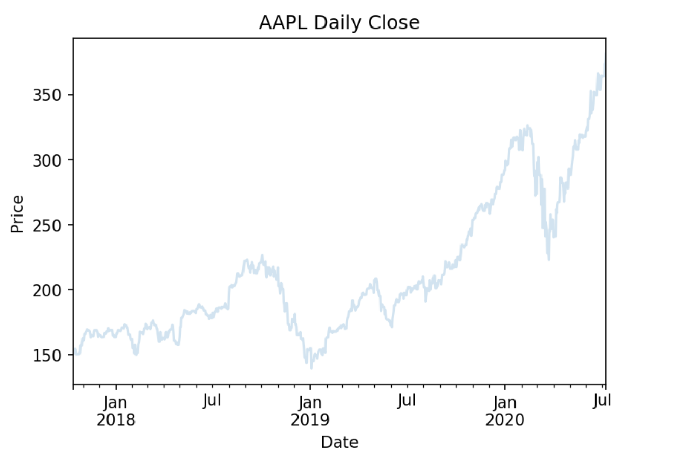
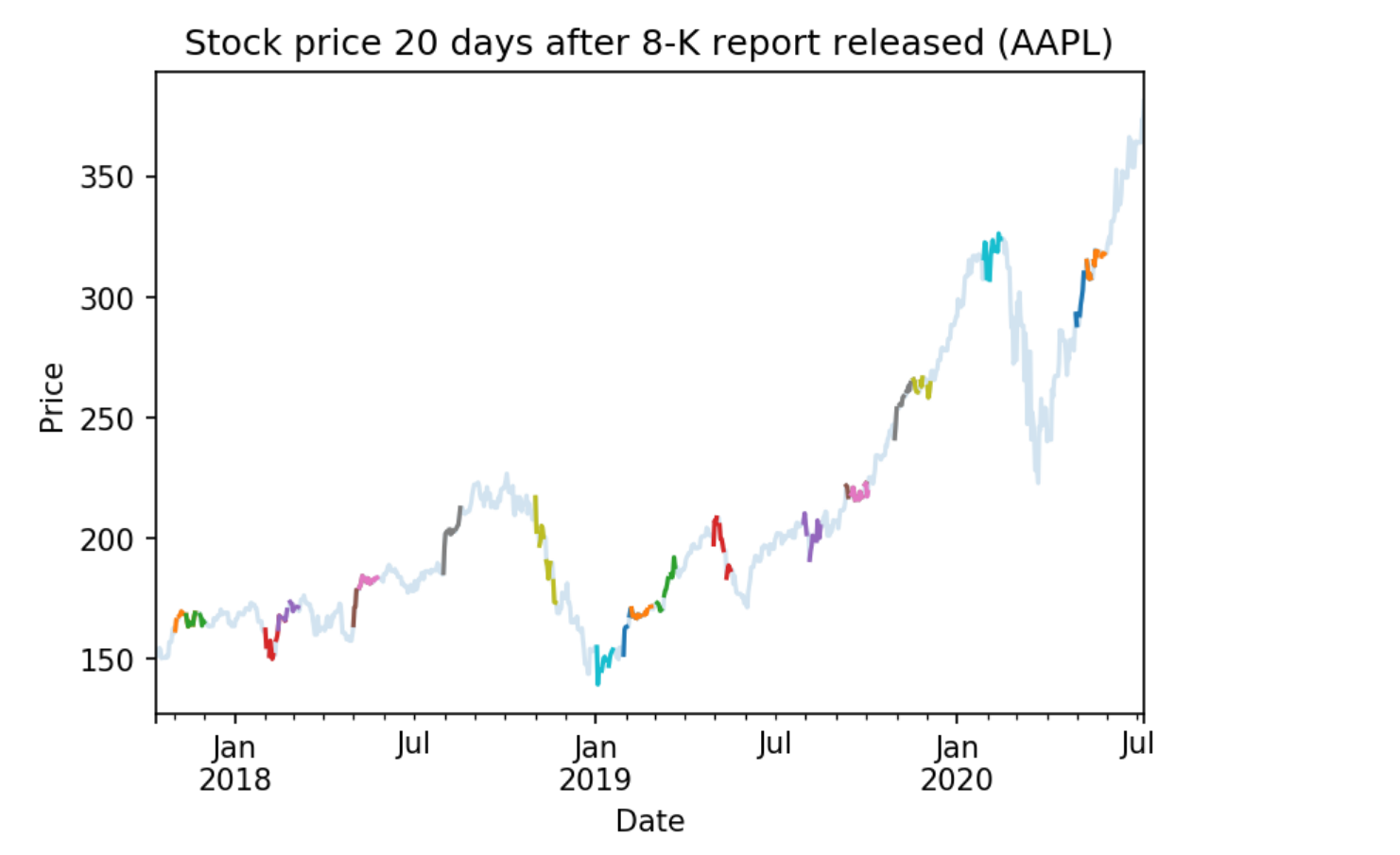
Then let's highlight the daily historical closes after an 8-K release by replotting those close values on top of the previous plot.
# For every date that an 8-K is released
for date in report_history.index.levels[1]:
    start_time = date
    end_time = date + timedelta(days=20)
    aapl_history_daily.loc[start_time:end_time]['close'].plot() # Plot the historical close values 20 days after
Federal Reserve Data
The Federal Reserve bank of St. Louis, MO provides free macroeconomic indicators and other figures. QuantConnect hosts this Federal Reserve Economic Data (FRED) for use in your algorithms. This data includes various volatility measures, recession indicators, interest rates, and other factors that can be used to analyze the relationships between macroeconomic factors and the market. You can find a full list of these factors in the Alternative Data documentation.
Making History Calls
Let's analyze how SPY performs when there is a recession according to the From Period Following Peak Through The Trough indicator. We can subscribe to FRED data with qb.AddData(FRED, Selector), where Selector is the metric we wish to analyze.
# We must import any custom data that we want to use
from QuantConnect.Data.Custom.Fred import *


# Add SPY to see how the market reacts to the recession indicator
spy = self.AddEquity("SPY")

# Add Federal Reserve Economic Data (FRED) custom data
oecd = self.AddData(Fred, Fred.OECDRecessionIndicators.UnitedStatesFromPeakThroughTheTrough)
We can then make requests for the OCED recession indicator data using qb.History. History calls for alternative data sources are similar to history calls for price data. We can use either qb.History(Type, Symbol, StartDate, EndDate), where Type is the data type, Symbol is the symbol for which to retrieve data for, or we can use qb.History(Type, Symbol, Period), which returns historical data from the given past period starting from today's date.
# We request for 1000 days of data starting from today
spy_daily = self.History(spy.Symbol, timedelta(days=10000), Resolution.Hour)
oecd_history = self.History(Fred, oecd.Symbol, timedelta(days=10000))

# Drop the symbol index from multi-index dataframe, so that we have a time series
oecd_history = oecd_history.reset_index(level=0, drop=True)
spy_daily = spy_daily.reset_index(level=0, drop=True)
Accessing and Manipulating Data
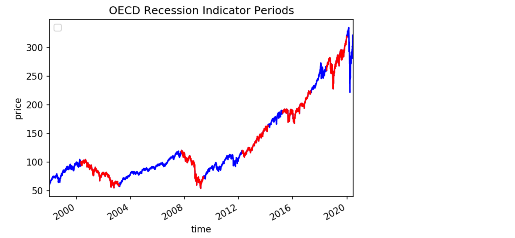
The OCED From Period Following Peak Through The Trough indicator returns a value of 0 if there is not a recession and 1 if there is a recession. In order to analyze how the indicator correlates to SPY, we can plot the daily close of SPY in red if there is a recession and in blue otherwise. We can achieve this by first plotting the overall daily close values in blue and then plotting the recessionary periods on top in red.
# Chart formatting
plt.title('OECD Recession Indicator Periods')
plt.legend(('SPY (no recession)', 'SPY (in recession)'))
plt.ylabel('price')

# Plot first so that we can put the recessionary period on top of the price graph
spy_daily['close'].plot(color='blue')
We can find the recessionary periods by looping over the time periods when there is a continous recession and adding them to a list, We cab then separate the chart into periods of indicated recession and periods of no recession.
recessions = [] # list to hold periods of recession

# helper pointers
i = 0
previous = 0

# Loop over values in oecd history
for period, df in oecd_history.iterrows():
    # if there is currently a recession
    if df['value'] == 1:
        # add that date to list of recessions
        if not i == len(recessions) - 1:
            recessions.append([])

        recessions[i].append(period)

    # if a recessionary period has ended, increment i
    if previous == 1.0 and df['value'] == 0.0:
        i += 1

    previous = df['value']
To plot the recessionary periods, we can loop over our list of recessions, find the start and end dates of each recession and replot the SPY daily close values in red for those periods.
for recession in recessions:
    # Get the start and end dates of the recession period
    recession_start = recession[0]
    recession_end = recession[-1]

    # Plot the start and end of the recession in red
    spy_daily.loc[recession_start:recession_end]['close'].plot(color='red')
US Energy Information Administration
The United States Energy Information Administration (EIA) publishes bulk archives of energy data. QuantConnect processes and caches petroleum data from these archives for easy deployment. The EIA petroleum data contains roughly 200 metrics for a variety of countries. You can find a full list of these metrics in the Alternative Data documentation.
Making History Calls
We can analyze how the US stockpile of motor gasoline correlates to value of Chevron (CVX), a multinational energy corporation. We will need price data for CVX and EIA data for Weekly Ending Stocks Of Finished Motor Gasoline. In order to make a history call, we need to first subscribe to data. We can subscribe to CVX data using qb.AddEquity(Symbol) and qb.AddData(USEnergy, Selector), where Selector is the metric we wish to analyze.
# Add Chevron (CVX) to see how it relates to petroleum metrics
cvx = self.AddEquity("CVX")

# Add weekly finished motor gasoline stockpile data
weekly_finished_motor_gasoline = self.AddData(USEnergy, USEnergy.Petroleum.UnitedStates.WeeklyEndingStocksOfFinishedMotorGasoline)
We can then make requests for the petroleum metric data using qb.History. History calls for alternative data sources are similar to history calls for price data. We can use either qb.History(Type, Symbol, StartDate, EndDate), where Type is the data type, Symbol is the symbol for which to retrieve data for, or we can use qb.History(Type, Symbol, Period), which returns historical data from the given past period starting from today's date.
# We request for 1000 days of data starting from today
cvx_history = self.History(cvx, timedelta(days=1000), Resolution.Hour)
gas_history = self.History(USEnergy, weekly_finished_motor_gasoline, timedelta(days=1000))

# Drop the Symbol index from multi-index dataframe
cvx_history = cvx_history.reset_index(level=0, drop=True)
gas_history = gas_history.reset_index(level=0, drop=True)
Accessing and Manipulating Data
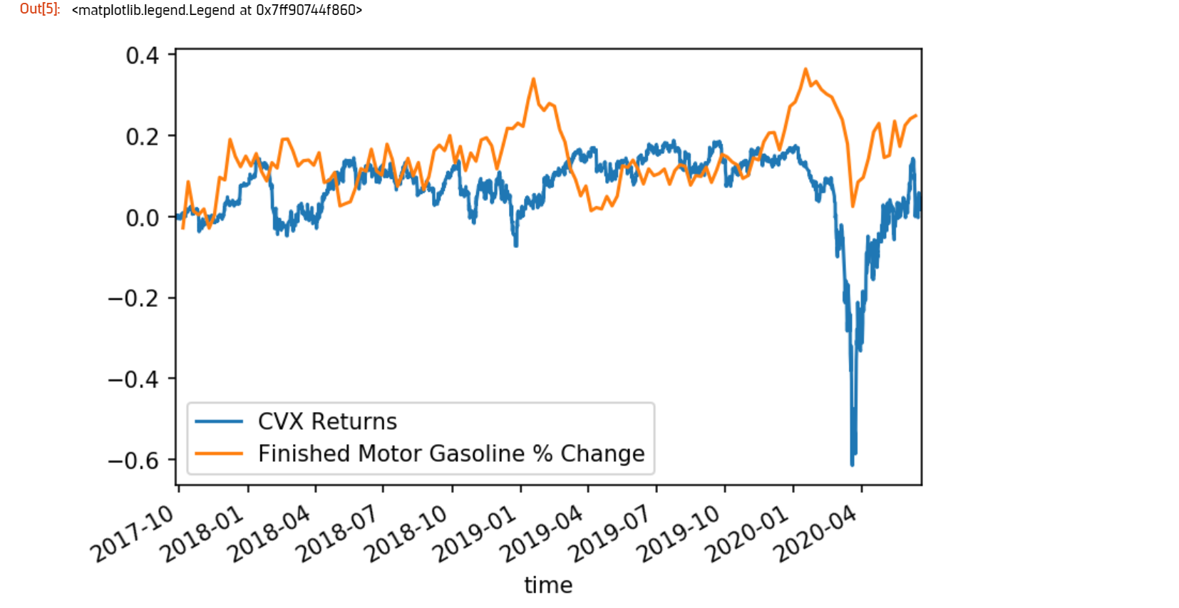
One way to visualize how the value of CVX correlates to the stockpile of motor gasoline is to plot the cumulative returns of CVX against the cumulative % change in the stockpile.
# Plot the cumulative percent change in the returns of CVX
cvx_history['close'].pct_change().cumsum().plot()
# Plot the cumulative percent change in the stockpile
gas_history['value'].pct_change().cumsum().plot()

# Format chart
plt.legend(('CVX Returns', 'Finished Motor Gasoline % Change'))
CBOE Volatlity Data
The Chicago Board Options Exchange (CBOE) provides daily exports of their most popular volatility indices. QuantConnect caches this data for easy deployment in your algorithms. You can learn more about CBOE data in the Alternative Data documentation.
Making History Calls
The VIX is a volatility index which is derived from the bid-ask spread of S&P 500 index options. It provides a measure of overall market risk and investor sentiment. The VIX's value rises when markets are unsteady and volatile, and falls when volatility recedes.
Let's analyze how the market behaves during volatile times by comparing the VIX with SPY. We can subcribe to VIX data using qb.AddData(CBOE, "VIX").
# We must import any custom data that we want to use
from QuantConnect.Data.Custom.CBOE import *


# Add CBOE VIX  data.
vix = self.AddData(CBOE, "VIX")

# Add SPY to see how the market is during volatile periods
spy = self.AddEquity("SPY", Resolution.Daily)
History calls for alternative data sources are similar to history calls for price data. We can use either qb.History(Type, Symbol, StartDate, EndDate), where Type is the data type, Symbol is the symbol for which to retrieve data for, or we can use qb.History(Type, Symbol, Period), which returns historical data from the given past period starting from today's date.
# History call for 1000 days of VIX and SPY data
vix_history = qb.History(CBOE, vix.Symbol, timedelta(days=1000))
spy_history = qb.History(spy.Symbol, timedelta(days=1000), Resolution.Daily)

# drop the Symbol index from multi-index dataframe
vix_history = vix_history.reset_index(level=0, drop=True).
spy_history = spy_history.reset_index(level=0, drop=True)
Accessing and Manipulating Data
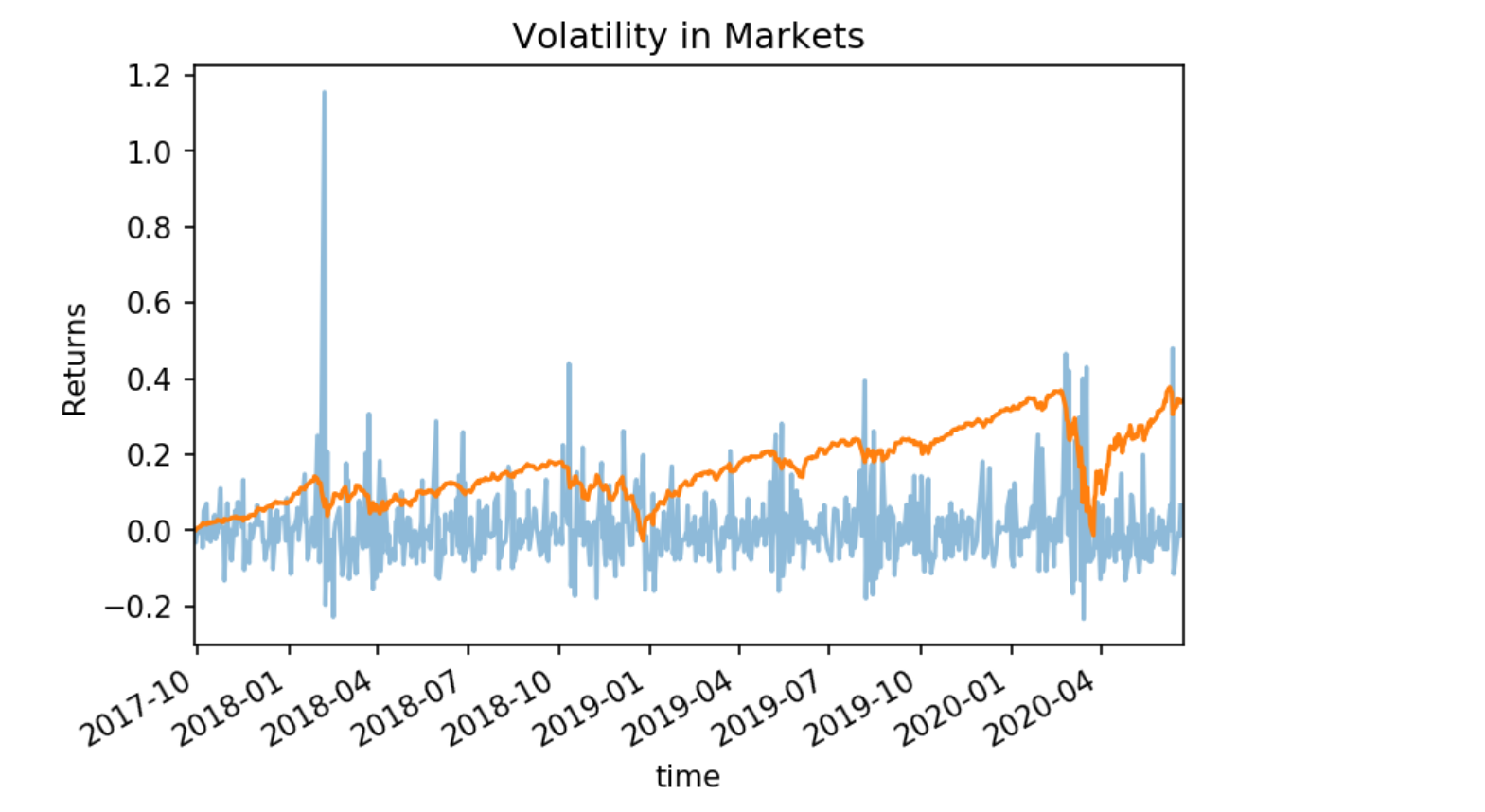
To visualize how the spikes in the VIX correlate to in the volatility market, we can plot the daily percent change in the VIX against SPY.
# Chart formatting
plt.title('Volatility in Markets')
plt.xlabel('Time')
plt.ylabel('Returns')

# Plot the percent change in daily close values of VIX and SPY
vix_history['close'].pct_change().plot(alpha=0.5) # Increase transparency of VIX plot
spy_history['close'].pct_change().cumsum().plot()
 ORGANIZATIONS

