Research
Plotting in Research
Introduction
The research environment is centered around analyzing and understanding data. One way to gain a more intuitive understanding of the existing relationships in our data is to visualize it using charts. There are many different libraries which allows us to chart our data in different ways. Sometimes the right chart can illuminate an interesting relationship in the data. QuantConnect supports many of the popular chartin frameworks like matplotlib and Plotly. You can find a full list of supported libraries, including plotting libraries, in the Supported Libraries documentation.
Matplotlib
Matplotlib is the most popular 2d-charting library for python. It allows you to easily create histograms, scatterplots, and various other charts. In addition, pandas is integrated with matplotlib allowing you to seamless move between data manipulation and data visualization. This makes matplotlib great for quickly producing a chart to visualize your data.
Example 1: Histogram
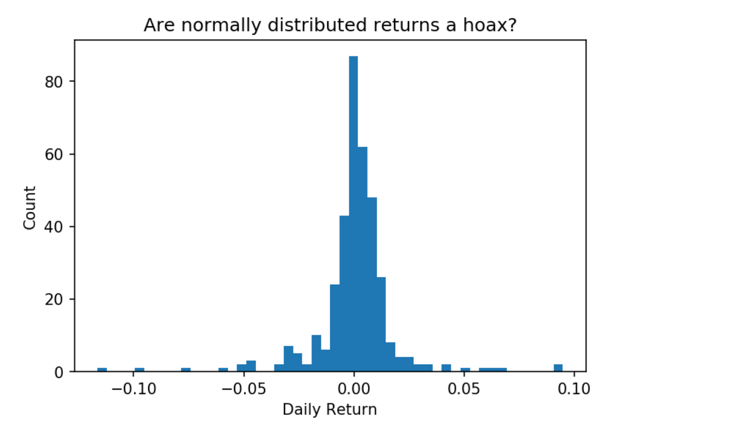
Let's plot the distribution of daily returns of SPY on a histogram.
import matplotlib.pyplot as plt

qb = QuantBook()
spy = qb.AddEquity("SPY")
spy_hist = qb.History(qb.Securities.Keys, 360, Resolution.Daily).reset_index(level=0)
We can calculate SPY's daily returns by finding the percent change of its daily close values using spy_hist['close'].pct_change(). Then we can plot the distribution of daily returns.
# Calculate daily returns
spy_daily_ret = spy_hist['close'].pct_change()

# Plot histogram of daily returns with 50 bins
plt.hist(spy_daily_ret, bins=50)

# Chart formatting
plt.title('Are normally distributed returns a hoax?')
plt.xlabel('Daily Return')
plt.ylabel('Count')

Example 2: Line Graph
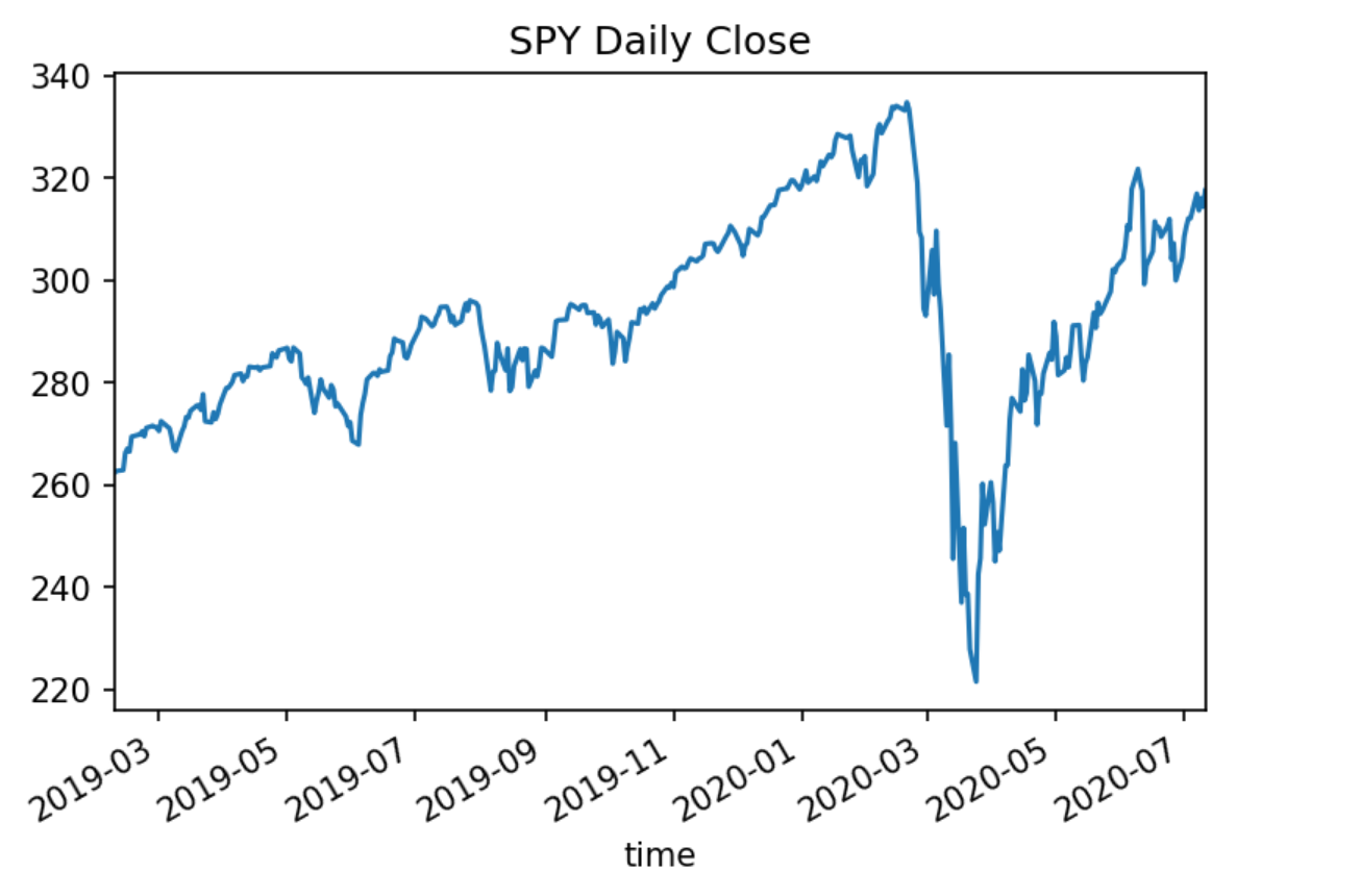
Plotting a line graph from a pandas dataframe is made easy using the built in pandas dataframe.plot() method.
# Plot close prices as line graph
spy_hist['close'].plot()

# Chart formatting
plt.title('SPY Daily Close')

Example 3: Scatterplot
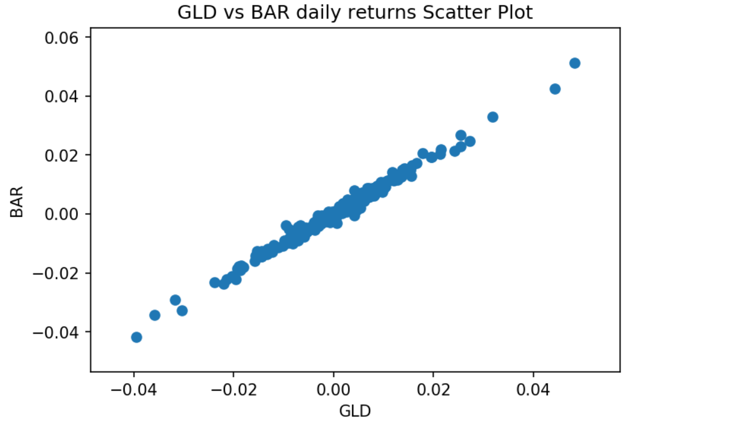
ETFs which track the same underlying, for example, gold ETFs like GLD and BAR, should produce the same returns. We can check the validity of this statement by plotting their returns on a scatterplot.
# Add data for gold ETFs
qb.AddEquity('GLD')
qb.AddEquity('BAR')

# Make daily resolution data history call for our ETFs
gold_etf_hist = qb.History(['GLD', 'BAR'], 300, Resolution.Daily)

# Calculate daily returns for each ETF
gld_ret = gold_etf_hist.loc['GLD']['close'].pct_change()
bar_ret = gold_etf_hist.loc['BAR']['close'].pct_change()

# Plot ETF returns in scatterplot
plt.scatter(gld_ret, bar_ret)

# Chart formatting
plt.title('GLD vs BAR daily returns Scatter Plot')
plt.xlabel('GLD')
plt.ylabel('BAR')
plt.show()

Plotly
Plotly is an online charting tool with a python API. It offers the ability to create rich and interactive graphs.
Example 1: Line Chart
Let's create a simple line chart of the SPY daily highs using Plotly. We'll first need to make a history call for SPY daily data.
qb = QuantBook()
spy = qb.AddEquity("SPY")
spy_hist = qb.History(qb.Securities.Keys, 360, Resolution.Daily).reset_index(level=0)
Next, let's plot this dataframe as a line chart. We'll need to reset our indices so that we can reference our timestamps as a column. This allows us to use plotly.express.line to plot our dataframe.
# import plotly.express
import plotly.express as px

spy_hist2 = spy_hist.reset_index()
# set the time column as our x-axis and high column as our y-axis
fig = px.line(spy_hist2, x='time', y='high')

fig.show()

Example 2: Candlestick Graph
Line plots limit us because they don't allow us to view all of the bar information available in our history call. We are limited to plotting only the high value of each bar. However, Plotly allows us to chart candlesticks which convey much more information about each bar, including its OHLC and whether that bar is bull or bear. Let's plot the same historical data in a candlestick chart.
import plotly.graph_objects as go

fig = go.Figure(data=[go.Candlestick(x=spy_hist.index,
                open=spy_hist['open'],
                high=spy_hist['high'],
                low=spy_hist['low'],
                close=spy_hist['close'])],
                layout=go.Layout(
                    title=go.layout.Title(text='SPY OHLC'),
                    xaxis_title='Date',
                    yaxis_title='Price',
                    xaxis_rangeslider_visible=False
    ))

fig.show()

Seaborn
Seaborn is a data visualization library based on matplotlib. It makes it easier to create more complicated plots. It also allows us to create much more visually appealing charts than offered by matplotlib.
Example 1: Heatmap Chart
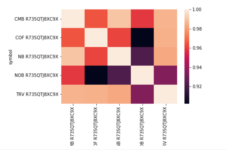
It is a well-known phenomenon that the price of stocks in the same sector may sometimes be correlated over periods of time. A good example of this is Coca-Cola and Pepsi, which not only operate in the same industry but also sell similar products. We can determine if two stocks are correlated over a period of time by calculating the correlation coefficient of their prices. Let's examine a set of stocks in the banking industry and check whether any pair of stocks are correlated.
import seaborn as sns

qb = QuantBook()

tickers = [
    "BAC", # Bank of America Corporation
    "COF", # Capital One Financial Corporation
    "C",   # Citigroup Inc.
    "JPM", # J P Morgan Chase & Co
    "STI", # SunTrust Banks, Inc.
    "WFC", # Wells Fargo & Company
]
symbols = [qb.AddEquity(ticker, Resolution.Daily).Symbol for ticker in tickers]
Let's make a history call for the close values over a period of a few months for our banking stocks. Then we can use the pandas method dataframe.corr() to calculate the correlation matrix.
history = qb.History(symbols,
                     datetime(2020, 2, 1),
                     datetime(2020, 7, 1),
                     Resolution.Daily).close.unstack(level=0)

correlation_matrix = history.corr()

Then using seaborn we can chart our correlation matrix as a heatmap, revealing to us which stocks were correlated over that period of time. Correlation values close to 1 correspond to closely correlated stocks.
sns.heatmap(correlation_matrix)

 ORGANIZATIONS

